3 Simple Fixes To Get More Conversions On Your Website

Your website visitors are engaged, but are they taking the action you want? Here’s 3 ways to remove friction and get more conversions on your website.
High engagement doesn’t always translate to high conversion. Often, it’s the subtle points of friction—a poorly placed CTA, an overloaded layout, or a distracting element—that disrupt the user journey.
Optimizing for conversion means identifying and eliminating these barriers with precision.
In this article, I’ll walk you through three simple ways to reduce friction and increase conversion on the website.
Let’s dive in.
1. Show, Don’t Just Tell

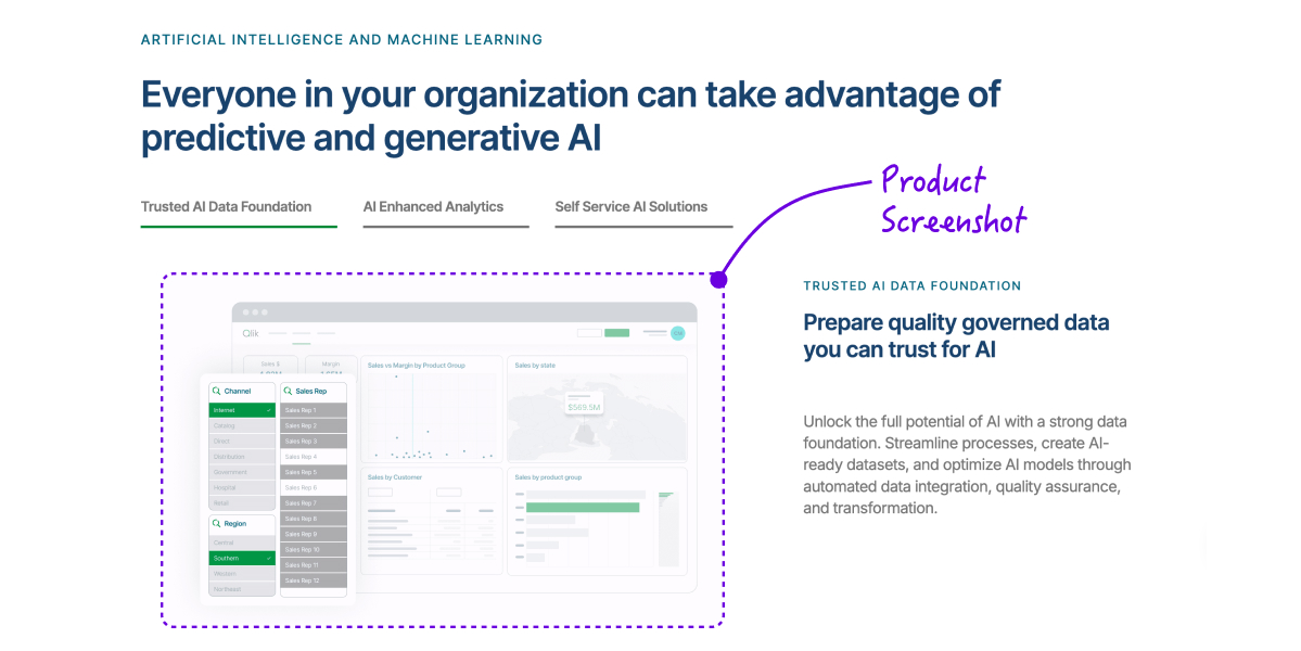
Here’s a recurring mistake we see: spending five figures on a brand refresh, then slapping abstract blobs and colorful shapes on the homepage.
We all want to look sleek and modern. But here’s the thing, your buyer isn’t buying your brand aesthetic. They’re buying your product. And if they can’t see it, they won’t believe in it.
So use real UI screenshots to build trust, and clarity. They answer unspoken questions immediately:
- What does it do?
- How does it work?
- Can I imagine myself using it?
Without that visual proof, you’re asking someone to buy a painting they’ve never seen. And no matter how nice the frame looks, they won’t sign-up.
2. Use Social Proof Where It Counts

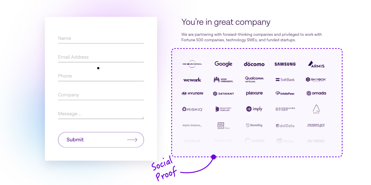
It’s a familiar scenario: a lead capture form asks for your name, email, company, and job title, sometimes even more.
Now picture that same form, but this time, it’s surrounded by the logos of trusted brands. Next to it, a testimonial from a real customer explains how your product saved their team 10 hours a week.
The perception changes instantly. That’s social proof placed strategically. Not buried in a testimonial slider few will scroll through. Not hidden at the bottom of the page. But positioned exactly where the user is likely to pause – right next to your call-to-action, pricing, or signup form.
At that moment, social proof does more than enhance credibility. It becomes a critical trust signal that reduces hesitation and encourages action.
Because when prospects see that companies they admire already trust you, they’re far more likely to do the same.
3. Tailor Messaging to Match Stakeholder Priorities

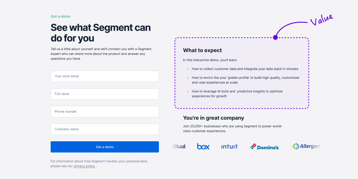
Conversion pages aren’t just digital brochures—they’re decision-making tools. And when those decisions involve multiple stakeholders, your messaging needs to do more than speak generally about value—it must resonate specifically with the people evaluating your product.
- That includes technical users who want to know how it integrates.
- Decision-makers who care about ROI, risk, and scalability.
- And end-users who are focused on usability and day-to-day benefits.
Each group is looking for a different kind of assurance. If your content doesn’t address their priorities directly, you’re asking them to connect the dots—and that creates unnecessary friction.
Instead, tailor your messaging. Segment content by persona or role. And highlight the benefits that matter most to each one, especially at critical points like form fills, pricing pages, or product comparisons.
97% of buyers will visit your website to validate before making a decision.
Before they talk to sales. Before they book a demo. Before they even think about signing up.
And when they land on your site, they’re silently asking three critical questions:
- What does this product actually do?
- Is it relevant to me or my team?
- Can I trust this company to deliver?
If the answers aren’t clear within seconds, they don’t stick around to find them.
They bounce. No form fill. No trial. No conversation. Just a missed opportunity.
So it’s worth asking yourself:
- Is it immediately obvious what we offer?
- Can users see the product in action – screenshots, videos?
- Are we providing the right proof and context at the right moments?