
When you sell a complex technical product—especially something backend-heavy like an API platform, observability tool, or data pipeline—it’s not always straightforward to show it on your website. And yet, buyers expect clarity.
They want to understand what your product does, how it fits into their stack, and why it matters. Fast. But that’s where most websites fall flat. Instead of showing how the product works, they lean on vague diagrams, stock images of people, or abstract illustrations that confuse more than clarify.
Why Visualizing Backend Products Is So Difficult
1. There’s Nothing to “See”
Unlike frontend apps or SaaS dashboards, backend products don’t offer flashy interfaces.
Your API might reduce latency or improve security—but what does that look like? Most of the magic happens in code, logs, or behind-the-scenes pipelines. There’s nothing visual to grab onto.
That often leads marketers to reach for stock photos or generic tech backgrounds. The result? A website that doesn’t reflect your product’s real power.
2. Too Much Complexity
You might be dealing with: Distributed systems, Event-driven architectures, Protocol-level integrations, Multi-cloud deployments, Security and compliance workflows
It’s hard to communicate all of that without overwhelming visitors.
Try to cram everything into one diagram, and it either looks like a circuit board—or gets watered down so much that it loses meaning.
How to Do It Right: 5 Practical Ways to Visualize Technical Products
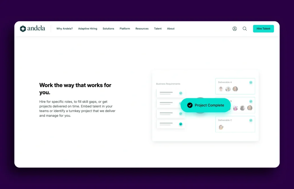
1. Use Case-Based Graphics

Instead of generic images, create visuals around real use cases. Example: Create flow-based visuals that walk users through a real scenario. Use icons, labels, and subtle animations to guide the story.
2. Simplify Complex Concepts with Diagrams

Not every concept needs to be reduced to an infographic. But diagrams—when done right—are incredibly effective for breaking down complexity. Use diagrams to show:
- How your architecture works
- Where your product fits into the stack
- How different systems connect
- How your product scales or handles failures
Create multiple smaller diagrams for specific purposes, and use progressive disclosure (e.g., collapsible sections or modals) for deeper dives.
3. Highlight Key Features Visually
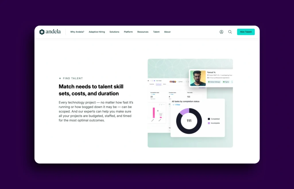
Got a dashboard? Great—don’t just slap a screenshot on your site. Instead:
- Zoom in on a key feature
- Annotate it to show what each part does
- Use callouts to highlight metrics or insights
Make the visual feel like a guided tour. Show what’s actionable and why it matters.
If your product doesn’t have a UI, try visualizing the output—for example, show log data changing over time, or the result of an API call.
4. Blend Multiple Visual Formats
There’s no rule that says you have to pick just one format. Use a mix of:
- Custom illustrations
- Short animations or loops
- Code snippets or terminal outputs
- Interactive walkthroughs
- Embedded videos or GIFs
This helps keep the experience engaging and allows different types of users to learn in the way that works best for them. Don’t be afraid to lean into motion—especially to show how a process unfolds over time.
5. Keep Every Visual Focused on a Single Message

The biggest mistake? Trying to do too much in one visual. Each graphic, animation, or screenshot should answer one key question or communicate one key point. Ask yourself:
- What is the purpose of this visual?
- What do I want the viewer to understand, feel, or do next?
- Am I reinforcing the same message in the surrounding copy?