The Alignment Problem No One Talks About
Every enterprise team has felt this pain: you’ve given your agency or internal design team crystal-clear direction. You’ve shared references. You’ve explained what the brand stands for. Yet when the first design comps come back, they somehow miss the mark.
Instead of building momentum, you lose weeks. Feedback loops spiral into endless revisions. Stakeholders get frustrated. Timelines slip. Budgets inflate.
For enterprise companies running multi-million-dollar launches, brand credibility and speed-to-market are everything. When your design process breaks down, the consequences ripple:
- Delays stall campaign rollouts, sometimes by entire quarters.
- Escalating costs erode budgets meant for innovation.
- Lost confidence weakens trust between stakeholders and your design team.
We’ll unpack why traditional design reviews fail, and show you how shifting from page-level reviews to component-driven mood boards changes the game. You’ll get a behind-the-scenes look at eight25’s proven five-step process—from audit and preparation to building scalable design systems—and see how it’s helping enterprise teams cut rework, align faster, and future-proof their websites.
Why Traditional Design Reviews Don’t Work
Most design reviews still follow the same playbook: designers deliver full-page mockups, stakeholders react, revisions follow, rinse and repeat.
At first glance, it seems efficient. You’re reviewing the “real thing.” But in practice, it’s a trap.
The pitfalls of full-page mockups:
- Broad, subjective feedback
Instead of focusing on usability and strategy, reviews devolve into:
“Can we make it look more like Stripe?”
“I don’t like this shade of blue.” - Taste wars
When every stakeholder brings personal preferences to the table, discussions shift from strategic alignment to arbitrary opinions. - Endless iterations
Each round of feedback generates rework across the entire design. The bigger the organization, the more rounds pile up.
The result: projects stall in what we call the “feedback swamp”—where direction is unclear.
Think of it like ordering food.
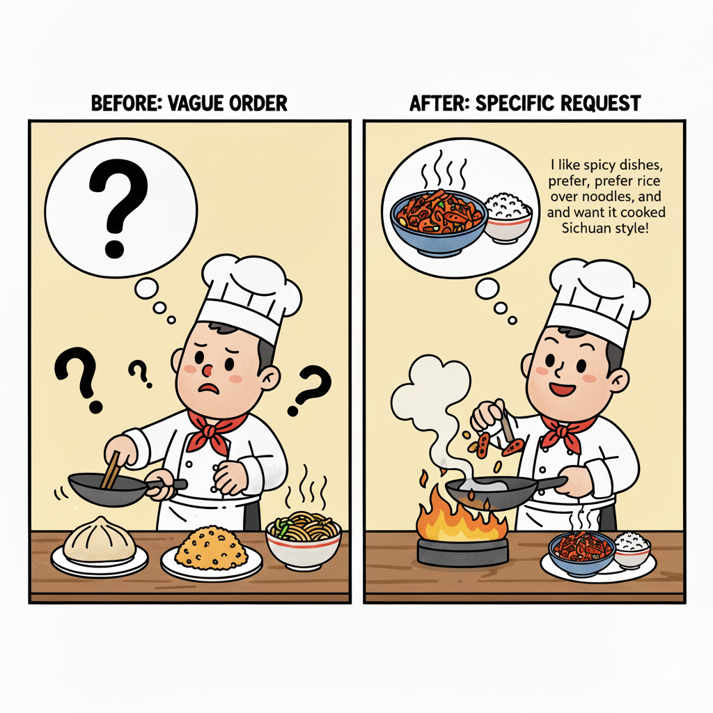
If you tell a chef, “I want Chinese food,” what comes back could vary wildly depending on interpretation. One person imagines Kung Pao chicken, another thinks dumplings, someone else expects fried rice. The request is too broad, so what you get often misses the mark.
Now compare that to being specific: “I like spicy dishes, prefer rice over noodles, and want it cooked Sichuan style.” Suddenly, the chef knows exactly what to prepare. The result is far more likely to match your expectations on the first try.
The Shift: From Pages to Components
The breakthrough comes from rethinking the unit of review. Instead of presenting pages, present components.
Think of it this way:
- A webpage is a meal.
- Components are the ingredients.
If you only review the full meal, feedback is vague: “It doesn’t taste right.” That doesn’t tell the chef what to change. But if you review the ingredients—the sauce, the spice blend, the garnish—you can pinpoint what works and what doesn’t.
Why component-level reviews work:
- Granularity: You discuss specific elements—like hero banners, CTAs, or navigation—not an entire page at once.
- Clarity: Feedback is easier to categorize (“this CTA feels off” vs. “the whole page feels wrong”).
- Reusability: Validated components can be used across multiple pages, creating consistency.
- Alignment: Stakeholders agree on building blocks before the site is assembled.
This is where eight25’s Mood Board Process transforms alignment.
Inside eight25’s Mood Board Process
We built this framework specifically for enterprise teams—where multiple stakeholders, high-stakes launches, and complex requirements collide. Here’s how it works:
Step 1 – Audit & Preparation
Every successful mood board session starts long before the workshop itself. For enterprise-scale projects, preparation isn’t just a formality—it’s the foundation that determines whether the session drives clarity or descends into chaos.
This stage is all about context. We don’t walk in with a blank canvas; we walk in with a deep understanding of the brand, its assets, and its goals.
Here’s what the audit phase includes:
- Reviewing existing brand assets and component libraries
We take stock of what already exists—logos, typography guidelines, imagery, and any digital component libraries in use. For enterprises, this often means sifting through years of accumulated assets across different business units. The goal is to identify what’s still relevant, what’s outdated, and where inconsistencies are creating friction. - Collecting references from the client
Stakeholders come to the table with inspiration, whether it’s competitor websites, admired brands, or even unrelated digital experiences they want to emulate. These references give us a window into the aspirations of the brand. Instead of guessing, we bring those references into the process to anchor discussions in concrete examples. - Defining goals with precision
Enterprise design projects often juggle competing priorities. Some teams want speed to market. Others push for accessibility compliance. Some prioritize innovation, while others care most about preserving brand consistency across regions. During preparation, we help stakeholders articulate and rank these goals, so every decision in the workshop ties back to what matters most.
- Laying the groundwork for governance
By aligning early on governance considerations—like WCAG accessibility, scalability across multiple sites, and internal design ops processes—we avoid surprises later.
Why it matters: This preparation ensures that when stakeholders sit down for the workshop, they’re reacting to options grounded in their own context—not abstract design concepts. The session starts from familiarity, not confusion.
Step 2 – Component Mood Boards
The heart of the mood board process is reframing design reviews. Instead of asking stakeholders to react to a polished page design, we present modular component options—the building blocks of a site. This small shift transforms how feedback is given, how alignment is reached, and how fast decisions get made.
To see why this matters, let’s compare the traditional approach with the mood board approach:
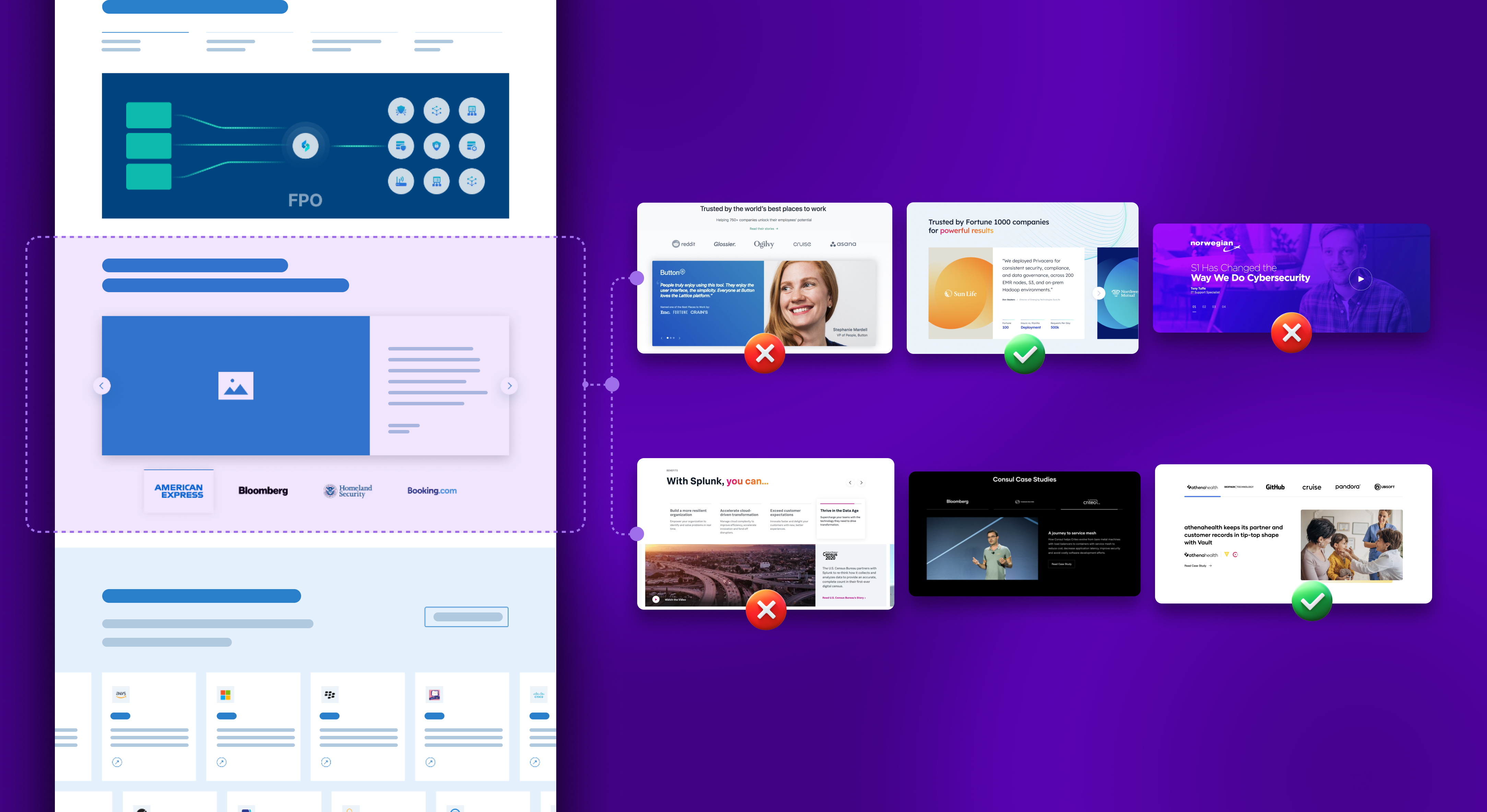
Before: Full-Page Mockups
Imagine a design team presents a fully designed homepage mockup to an enterprise stakeholder group. Here’s what usually happens:
- The conversation splinters: One stakeholder comments on the hero image. Another dislikes the button color. Someone else focuses on the navigation. The discussion quickly becomes unfocused.
- Feedback is vague: “It doesn’t feel modern enough,” or “Can you make it more like Stripe?” Without specificity, designers have to interpret what that means, often leading to multiple rounds of guesswork.
- Revisions ripple: If the CTA style changes after round three, it has to be updated across every page template. That means hours of additional design and development work.
- Consensus stalls: Different executives pull in different directions, and the review ends with a list of conflicting requests instead of a decision.
Result: Weeks lost in the feedback swamp, with costs and frustration mounting.
After: Component Mood Boards
Now, imagine the same team uses mood boards to present individual component variations side-by-side:
- Hero Sections: Three variations—one with a bold headline over video, one with minimalist typography, and one with an image overlay. Stakeholders react directly to the options and choose the one that best reflects brand tone.
- Navigation Bars: Two options—one sticky mega-menu, one simplified dropdown. The discussion centers on usability and governance, not aesthetics.
- CTAs: Three variations—high-contrast, ghost button, and inline banner. Stakeholders immediately agree that the ghost style is too subtle and align around the high-contrast version.
In just one workshop, every stakeholder’s input is heard, debated, and documented. Instead of leaving with vague feedback, the team leaves with validated component choices that can be scaled across the site.
Result: Alignment in days, not weeks—with changes made early, when they’re quick and cost-effective.
Why This Shift Matters for Enterprises
- Precision over vagueness: Instead of “the page doesn’t feel right,” stakeholders say, “We prefer CTA option one over option three.”
- Faster decisions: Focused comparisons cut through subjectivity and keep reviews on track.
- Reusable outcomes: Approved components become part of the enterprise design system, not just this project.
By breaking design down into its smallest, most influential parts, component mood boards transform feedback from chaos into clarity—accelerating timelines and reducing risk for enterprise launches.
Step 3 – Live Workshop
This is the heart of the process. We host a real-time workshop where stakeholders review the mood boards together.
Instead of async comments piling up in email threads, decisions are made on the spot. The facilitator guides discussion away from subjective taste wars and back toward:
- Usability data
- Brand goals
- Audience needs
Consensus is built live, not after weeks of scattered feedback.
The live workshop creates energy and sparks alignment, but without careful follow-through, it’s easy for decisions to get lost in the noise. That’s where feedback consolidation becomes critical. We don’t just capture notes—we transform raw discussion into a structured feedback matrix that becomes the single source of truth for the project.
This matrix ensures that every decision is:
- Visible (everyone sees what was agreed upon),
- Actionable (designers know exactly what to implement),
- Defensible (leaders can revisit the rationale behind each choice).
Example: Feedback Matrix for Component Reviews
| Component | Accepted | Rejected | Usability Notes & Priorities | Rationale / Context |
|---|---|---|---|---|
| Hero Section | Option 2 – Bold headline with image overlay | Option 1 – Minimalist text-only | Needs mobile-friendly scaling of text; test color contrast for accessibility | Stakeholders felt Option 2 balanced brand energy with clarity; Option 1 lacked visual impact. |
| Navigation Bar | Option 3 – Sticky mega-menu | Option 2 – Dropdown-only | Ensure WCAG compliance for keyboard navigation | Sticky design aligns with user flow data showing high interaction with top-level navigation. |
| CTA Buttons | Option 1 – High-contrast button style | Option 3 – Subtle ghost buttons | Prioritize large tap targets for mobile; include hover states | Option 1 tested best for visibility in usability benchmarks; Option 3 risked low conversion. |
| Content Cards | Option 2 – Image + headline combo | Option 4 – Text-only variation | Optimize for readability on mobile; ensure consistent spacing | Chosen for balance of information hierarchy and engagement. |
Why This Works for Enterprise Teams
- Clarity: Everyone knows what made the cut and why. No second-guessing weeks later.
- Governance: Usability and compliance notes are baked into the record, ensuring decisions scale beyond a single project.
- Efficiency: Designers don’t waste time re-exploring rejected options.
- Confidence: Stakeholders see their input translated into a transparent framework, which builds trust.
By the end of Step 4, the team isn’t just aligned in principle—they have a concrete decision log that can be carried into design systems, development handoffs, and even future rollouts.
Step 5 – Translate Into a Design System
The validated components don’t just sit in a deck. They’re translated into a scalable design system:
- UI kits in Figma
- Component libraries for developers
- Governance rules for consistency
The result: a design foundation that isn’t just for one website launch, but for every rollout going forward.
The Enterprise Benefits of This Approach
Enterprise web projects aren’t like small business redesigns. They involve multiple stakeholders across regions, complex governance structures, global brand standards, and launches tied to major revenue events. In this environment, the smallest inefficiency can ripple into millions of dollars in delays, lost opportunities, or reputational damage.
That’s why the mood board playbook directly addresses the pain points that matter most to enterprise leaders. Here’s how:
Faster Alignment = Shorter Timelines
In traditional reviews, alignment often takes months. Stakeholders react to entire page mockups, revisions cascade, and the project slows under the weight of subjective feedback. By contrast, component-first reviews compress alignment cycles into days, not weeks.
- Instead of debating whether an entire page feels “on brand,” stakeholders evaluate focused options for a single hero layout or CTA style.
- Decisions happen in real time, during facilitated workshops, eliminating the lag of endless email threads and asynchronous comments.
Impact: What once took five to six rounds of revisions can often be resolved in just one or two. For enterprises managing high-stakes launches, that translates to weeks regained on the timeline, enabling faster go-to-market execution.
Reduced Rework = Significant Cost Savings
Rework is the silent budget killer in enterprise projects. A single design change, made late in the process, can ripple across dozens of page templates and development hours.
The mood board process prevents that by surfacing potential misalignments early, when changes are fast, cheap, and easy. For example:
- Adjusting the style of a call-to-action button in a mood board takes a few minutes.
- Adjusting that same CTA after it’s been baked into 20+ fully designed pages and coded into production can take dozens of hours of design and development time.
Impact: By catching and correcting design missteps at the component stage, enterprises consistently avoid costly rework, keeping budgets intact and freeing resources for innovation rather than redoing what’s already been built.
Stronger Consensus = Stakeholder Confidence
Enterprise projects rarely suffer from a lack of opinions—they suffer from a lack of consensus. The mood board playbook solves this by replacing fragmented feedback with structured, facilitated alignment sessions.
- Every stakeholder, from marketing to product to regional teams, has a voice in the workshop.
- Feedback is captured, categorized, and documented—so there’s no ambiguity about what was agreed upon.
- The facilitator keeps discussions grounded in strategy and usability, not just personal taste.
Impact: This process builds confidence across the organization. Stakeholders walk away knowing their input has been heard, their concerns addressed, and the team aligned around a shared design vision. That confidence becomes buy-in, reducing pushback later in the project.
Scalable Design Systems = Future-Proof Websites
The true power of this approach lies not only in launching a website faster and with fewer headaches—it’s in building a foundation for the future.
Validated components don’t disappear after the project. They become part of a scalable design system that serves as the backbone for future initiatives:
- New campaign landing pages reuse the same hero and CTA patterns, preserving consistency.
- Regional microsites inherit global navigation and content modules, saving design time and ensuring brand alignment.
- Developers code once, then scale many times, reducing technical debt.
Impact: Enterprises gain a future-proof framework that accelerates every subsequent rollout. Instead of reinventing the wheel with every new initiative, they’re stacking on top of a proven, reusable system—saving time, money, and effort while strengthening brand consistency.
Best Practices for Enterprise Teams
Through dozens of enterprise rollouts, we’ve refined best practices that cut through noise and keep design alignment on track. These aren’t abstract theories they’re practical steps your team can apply immediately.
1. Show 3–5 Variations Per Component
The goal of mood boards is to accelerate clarity, not overwhelm decision-makers. When we present three to five design variations of a component—whether it’s a hero banner, a call-to-action, or a navigation bar—it gives stakeholders enough range to compare and react without drowning them in endless options.
- Why it works: Too few options, and people feel boxed in. Too many, and discussion stalls as preferences scatter. Three to five strikes the balance: it sparks debate while guiding the group toward a decision.
- How it plays out: Instead of debating whether an entire page “feels right,” stakeholders can confidently say, “We like version two’s typography but version three’s color scheme.” That precision cuts down revision cycles dramatically.
2. Focus First on High-Value Elements
Not all components carry equal weight. Elements like the hero section, navigation menus, and primary CTAs drive first impressions, user flow, and conversion. By aligning on these early, you create a north star that informs the rest of the design system.
- Why it works: When the hero and CTA patterns are locked in, secondary modules (like testimonial carousels or feature grids) fall into place faster because the visual direction is already established.
- How it plays out: Instead of wasting weeks perfecting a blog card style, you get executive consensus on the design elements that actually drive revenue and brand recognition.
3. Think Beyond This Project
The biggest mistake enterprise teams make is treating each redesign as a one-off. But the components you validate today are not just for this launch—they’re the building blocks of your entire digital ecosystem.
- Why it works: By treating each mood board decision as a long-term asset, you set up future projects—like product rollouts, microsites, or regional campaigns—for speed and consistency.
- How it plays out: A global enterprise that validates its navigation structure once doesn’t need to revisit it for every rollout. Instead, each new site inherits a tested, scalable pattern, cutting months off development timelines.
Enterprise design alignment isn’t about finding the “perfect” look. It’s about building consensus, clarity, and scalability.
Traditional design reviews—anchored in full-page mockups—invite misalignment, endless revisions, and wasted budget.
The mood board process flips the script: by focusing on components, aligning in real time, and translating feedback into a scalable design system, enterprise teams move from chaos to clarity.
At eight25, we’ve seen this playbook cut design cycles by weeks, save six figures in rework, and—most importantly—restore confidence in the design process for enterprise stakeholders.
So the next time you kick off a redesign, ask yourself:
- Do we want to wade through subjective feedback loops?
- Or do we want to validate components, align faster, and scale smarter?
If it’s the latter—this playbook is your way forward.