For enterprise companies, navigation isn’t just a menu at the top of the page, it’s the backbone of how buyers understand your offering, find relevant information, and take action. When the wrong link sends the wrong person to the wrong page, you’re not just frustrating them, you’re losing deals.
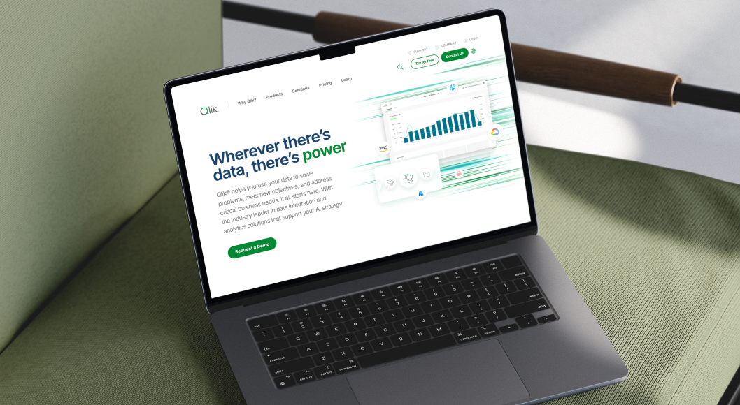
That’s exactly the challenge Qlik, a 14x Gartner Leader in Analytics & Business Intelligence, faced. After expanding their product portfolio, they needed enterprise website navigation that worked for two very different audiences without overwhelming either.
Why Navigation Is More Than Just a List of Links
In an enterprise website, the navigation is more than a visual element—it’s your conversion engine.
Done well, it helps users connect the dots between your products, capabilities, and value. Done poorly, it increases bounce rates, confuses prospects, and lengthens the buying cycle.
Common navigation pitfalls in enterprise sites include:
- Treating multiple audiences as a single group
- Linking to generic “catch-all” product pages
- Burying key resources deep in the site
- Offering no clear path from awareness to action
When product portfolios expand—whether through acquisitions, new product lines, or evolving use cases—the complexity only grows. Without a deliberate navigation strategy, your site becomes harder to use just when clarity matters most.
Why Enterprise Navigation Menus Lose Effectiveness Over Time
Even the best-designed navigation can lose its clarity and impact. For large, fast-moving B2B companies, there are a few common culprits:
1. Product Creep
As product lines expand—through acquisitions, new offerings, or feature rollouts—navigation structures are often patched instead of rethought. What starts as a clean, intuitive menu becomes bloated with too many options.
Example: A simple “Products” tab grows into a dropdown with 12+ mixed items, making it harder for users to quickly self-select the right path.
2. Audience Shift
Your buyer profile evolves over time, especially if you enter new markets or industries. A menu that once worked for one primary persona may confuse new audience segments who have different priorities and vocabulary.
Example: Terms like “Data Fabric” or “Data Mesh” might be familiar to technical teams but mean little to business-side decision-makers—causing hesitation or drop-off.
3. Inconsistent Labeling
When different teams add navigation items over time, labels and naming conventions become inconsistent. This erodes trust and makes it harder for users to predict where a link will lead.
Example: One menu item says “Resources,” another says “Insights,” and another says “Learning Hub”—all leading to overlapping content.
4. Content Sprawl
As marketing and product teams add assets, many get dumped into generic buckets (“Resources,” “Case Studies,” “White Papers”), rather than being placed contextually within product-specific paths. This forces users to hunt for what they need.
5. Shifting Business Priorities
Campaigns, launches, and corporate initiatives can temporarily hijack navigation real estate. Over time, these “quick fixes” can leave behind clutter that no longer aligns with the company’s core goals.
6. Platform Limitations
Legacy CMS or menu structures can’t always support modern UX patterns like mega menus, audience-based filtering, or contextual links. This leads to workarounds that limit usability.
Bottom line:
Navigation should be treated as a living part of your digital strategy, not a set-and-forget element. A periodic audit—checking for relevance, clarity, and performance—ensures that the menu continues to serve both the business and the user effectively.
The Challenge: Two Very Different Audiences, One Confusing Menu
Qlik’s product suite serves two primary groups:
- Data Analytics buyers — looking for analytics solutions.
- Data Integration buyers — seeking integration, transformation, and streaming capabilities.
Both groups had different priorities, decision criteria, and content needs. But the old navigation lumped everything together, forcing all users into the same pages.
The result?
- Misdirected clicks: Analytics buyers ending up on integration content they didn’t care about.
- Confused buyers: Visitors unsure whether products were standalone or part of a platform.
- Missed opportunities: High-value resources hidden several clicks deep.
The Strategy: Designing Navigation That Guides, Not Just Lists
Our approach was rooted in information architecture best practices principles. The goal:
- Early audience segmentation so users can self-select the right path.
- Progressive disclosure so the navigation isn’t overwhelming.
- Contextual resources that encourage conversion without extra searching.
Here’s how we restructured Qlik’s multi-audience website navigation.
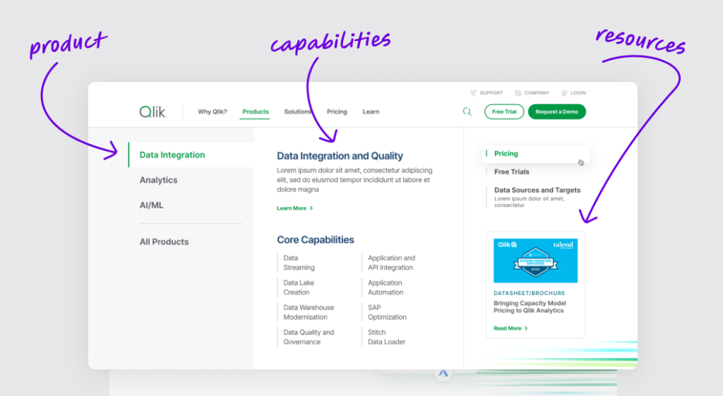
Step 1: Clear Product Segmentation
We created separate top-level tabs for:
- Data Integration
- Data Analytics
- AI / Machine Learning
This early separation allowed each audience to immediately identify where to go—removing guesswork and wasted clicks.
Why this matters:
For enterprise websites, product segmentation in navigation makes it clear what’s included, what’s separate, and where to start.
Step 2: Capabilities in Context
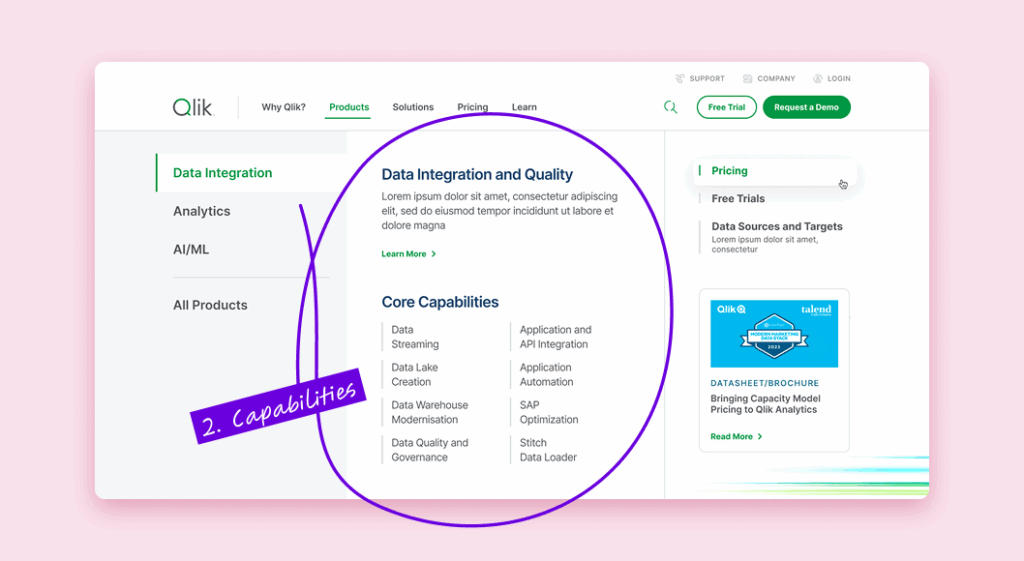
Under each product category, we used a three-column progressive disclosure structure:
- Column 1: Product category
- Column 2: Relevant capabilities (e.g., Data Streaming, Data Lake Creation, API Integration)
- Column 3: Action-oriented resources (e.g., Pricing, Trials, Datasheets)
By showing only the capabilities relevant to the selected product, we avoided information overload while still giving deeper detail to those who wanted it.
Step 3: Relevant, Action-Oriented Resources
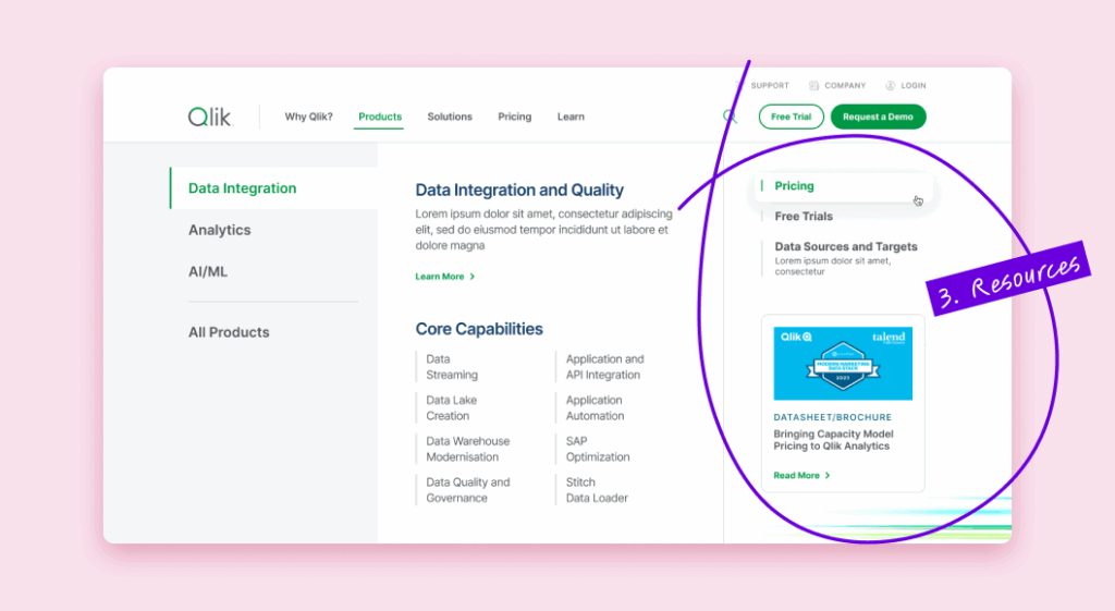
We tied resources directly to the product or capability—so a visitor interested in Data Integration could access pricing, free trials, or case studies in one click.
This context-driven approach to enterprise website navigation means every link in the menu supports the buyer’s decision-making process.
How Enterprise Companies Should Assess Their Current Navigation Menu
The challenge is that many companies only think about their menu during a full redesign, leaving years between meaningful updates. By then, audience needs, product lines, and market positioning have already shifted.
If you want to know whether your navigation is still working for you, start by asking three questions:
- Can each of your primary audiences find their path in two clicks or less?
If your top buyer types are forced into generic pages before seeing content tailored to them, you’re adding unnecessary friction. - Do your labels make sense to someone outside your company?
Internal terminology often creeps into menus over time. Test your labels with real prospects or a neutral third party to see if they instantly understand what’s behind each link. - Are key resources tied to the decision points where they matter most?
Product-specific pricing, trials, case studies, and datasheets should be directly accessible from relevant product pages—not hidden in a catch-all resources section.
A structured navigation audit (combining analytics, user testing, and business priorities) will quickly reveal whether your menu is guiding users toward conversion or steering them away.
Done right, this isn’t just a UX improvement; it’s a competitive advantage in a market where clarity, speed, and self-service are non-negotiable.