However, given that your competitors are also under the same scrutiny, how can you guarantee that your homepage hero is making the strongest possible impact, securing your place in the consideration set?
Homepage hero’s developed without best practices in mind, can impact your business in meaningful ways including significant lead loss, conversions and brand credibility.
Now, let’s delve into the numbers to emphasize the crucial role of your homepage hero.
- HubSpot found that 86% of visitors leave a website after visiting only one page.
- Nielsen Norman Group found that visitors spend about 8 seconds looking at the homepage hero before deciding where to click next.
Our own analysis of various websites reveals that: 74% of users exit after encountering the homepage hero, indicating that only one in four visitors ventures beyond this initial section.
Contrary to common assumptions about page length, the data paints a different picture. Among those who progress to the second panel, a notable 60% continue scrolling down to the bottom. This implies that the hindrance lies in the homepage hero’s perceived lack of engagement, discouraging users from even attempting to scroll further.
A Real-World Example
To give you some perspective, picture yourself as a VP of Security within a major healthcare organization who is looking to understand more about solutions they can implement.
Which of these two homepage heroes best conveys which solution is best suited for?
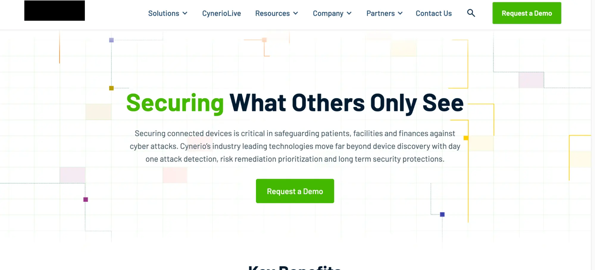
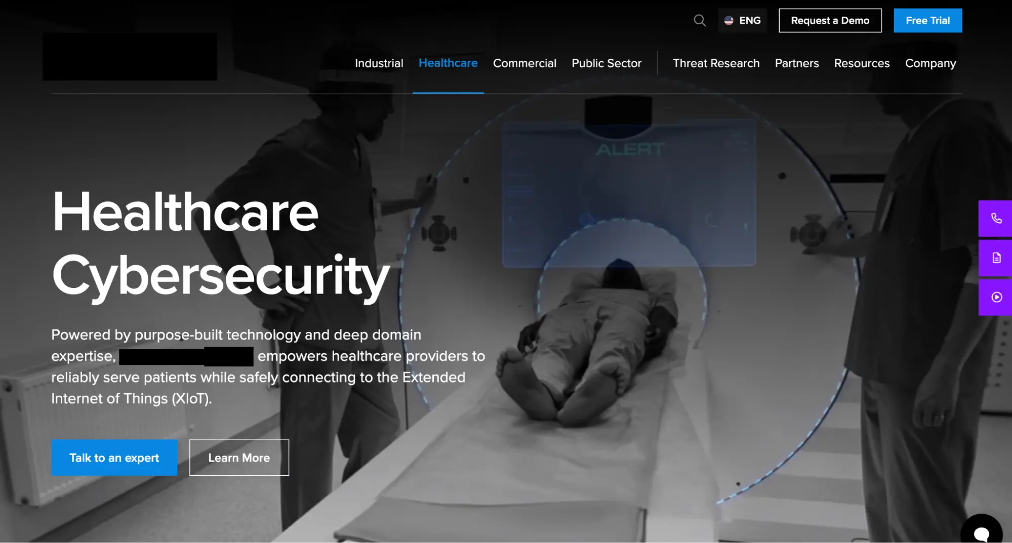
The 4 key factors you’ll observe in these examples include:
- Clarity: One example is more straightforward/clear.
- Relevance: One appears more relevant (suited to their business – healthcare).
- Professionalism: One projects a more mature and competent image.
- Call to Action (CTA): In example 2, the call to action “learn more” should be specific and focused, guiding users toward a particular action rather than a general exploration of the company or brand.
Three questions to assess if your homepage hero could potentially be repelling visitors
- Clarity: Is it explaining what your company does and why it matters in a simple and concise way?
- Indicate the category: Does it hint at the tech category you belong to? Who you are as a company (your industry or category)
- Call to Action (CTA): Does it offer a clear call to action, showing visitors what to do next?
Three actionable steps to improve your homepage hero
- Make certain your homepage hero clearly communicates your value proposition.
- Your homepage hero should clearly and concisely explain what your company does and why it’s valuable to potential customers. It’s also a good opportunity to highlight your unique selling proposition (USP) and differentiate yourself from the competition.
- This is amongst the most common pieces of advice we dispense. You may be surprised by how many (oftentimes) sophisticated clients come to us with homepage hero’s that rely extensively on creative expression that does not convey the value prop.
- Signal your tech category for enhanced visibility
- Imagine coming across a headline that reads: ‘Network Security for the Next Generation’. While it sounds promising, the frustration sets in if you’re in the process of shortlisting firewall vendors, and it takes half a page of reading to discover that the business primarily offers VPN software, for instance.
- Place your business within a technological category, helping visitors quickly grasp the domain or industry your product or service belongs to.
- Have a clear call to action that tells visitors what to do next
- Your homepage hero should make it effortless for visitors to find their next steps. Depending on the category in which you compete, your motion may require a demo before serious consideration, you may be in a highly complex category with a highly unique solution which may require an explainer video before one could realistically consider or – you may have a high performing piece of content (white paper/analyst report), and that is all a prospect needs to seriously consider.
- Using a clear call to action prompts them to engage further with your website, whether that’s signing up, exploring more, or making a purchase. Remember in the end, your prospects’ journeys are nonlinear – you may be their first stop, or you may be their last stop having come from a press article or whitepaper from somewhere else. Well considered CTAs drive high qualified leads.
Additional qualitative considerations for your homepage
- Your homepage hero should be visually appealing and attention-grabbing.
- Use high-quality images or videos that are relevant to your target audience and your company’s brand.
- If you serve a particular vertical audience, use vertical specific imagery to signal your commitment to that vertical. If you are competing in a software category – does it make sense to showcase your UI?
- Keep it short
- As mentioned before your visitors have a matter of seconds so keep your homepage hero messages concise and to the point.
In your pursuit of a compelling website, remember these key aspects: clarity, relevance, and professionalism.
Choose clarity in your messaging, ensuring visitors easily understand what you offer. Embrace relevance by tailoring your content to suit your business context, And when crafting your call-to-action, be specific and focused making it effortless for visitors to find their next steps.